October 7, 2022
Let’s be honest, online shopping has its perks — customers can browse stilettos from the convenience of their sofa in their softest pair of pajamas. But there’s one flaw that many product landing pages suffer from: there’s no thrill of discovery.
Here’s the problem: most product landing pages really are product detail pages (PDPs) and are focused on the hard sale. Out goes inspiration, browsing, and the thrill of discovery — and this is where most customers bounce. Instead of opening a door into your store, you’re showing them the exit.
Fortunately, there’s ways you can improve your product landing page experience and turn your online store into a place customers actually like to shop.
4 common issues with product landing pages
There’s a disconnect between what consumers see at their first point of engagement versus what they see on a PDP. Visitors who land on PDPs convert at 1.5%, while visitors who arrive on other pages of an e-commerce site convert at 2.9%.
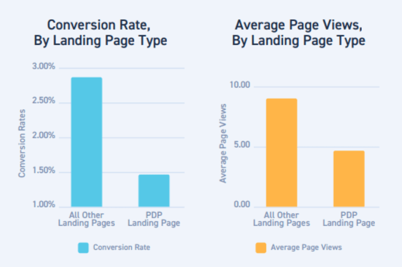
Below are the most common problems with product landing pages.
1. Your product landing page doesn’t allow customers to shop
As convenient and seamless as navigating the web is, it’s not easy to be inspired if you’re hunting for something new.
Think about brick-and-mortar shopping. Shoppers are in a mall, and a window display catches their eye. Maybe it’s a jacket being showcased. Maybe there’s mannequin sporting the latest sneakers. Or maybe they just appreciate the overall look and feel of a carefully crafted display. Either way, they’re tempted to go in and maybe even buy something they didn’t even know existed five minutes ago.
By contrast, the e-commerce discovery process is non-existent on most sites.
You search for the item you’re already intent on buying, and you’re given a list of slight variants on that item. You click on the product and get taken to a list of details and an “add to cart” button. If the price is right, you buy. E-commerce isn’t shopping in a mall, it’s ordering from a catalog.
Online customers rarely get that shot of joy that comes with stumbling upon a product they didn’t even know they needed — the product that has nothing to do with why they came in the store. And your store misses out in the long run.
Customers who enjoy their experience and are encouraged to browse will come back. Customers who stumble upon a treasure they didn’t know existed will remember your store.
2. PDPs are focused on one type of shopper
Ideally, an e-commerce product landing page should accomplish the following three things:
- Fulfill the promises you made in your ad or social media post
- Help the user understand your brand
- Inspire a visitor to take the next step in becoming a customer
However, when PDPs act as e-commerce landing pages, they often fall short of these three rules. And that’s a problem.
PDPs ignore all customers outside the bottom of the funnel
Almost 25% of online shoppers who arrive on e-commerce sites land on a PDP. And those who arrive on a PDP are 72% more likely to bounce than those who land on any other page of the site, according to research by Monetate.
Why? Because PDPs are primarily built to help a customer validate whether a product is one they’re looking to purchase. A PDP’s goal is hyper-focused on driving conversions at the bottom of the funnel. It’s not focused on helping customers find what they’re looking for or learn more about a brand or its ethos.
PDPs are critical for nurturing prospects who are close to making a purchase, but they ignore all customers who aren’t in the bottom of the funnel. For marketers, this is a challenge — you need your PDP to be easy to find, but it isn’t always the best foot to put forward.
New leads arrive on an e-commerce site looking to make a discovery, be inspired, or better understand a brand. But what they’re met with is a sterile page with information about one particular product. By redesigning these pages, you can improve engagement — as well as your bottom line.
3. Your product landing page doesn’t fulfill a promise
Users often arrive on a PDP via a lifestyle photo on social media or in an email that showcases various products. If that photo leads them to a PDP that focuses on only one item, the customer will likely be confused and may abandon the page.
Let’s say an image catches a customer’s eye on Instagram, and they want to learn more about the featured product. When they arrive on the PDP, they’re not greeted by the same photo. This erodes trust and creates confusion: “Is this even the same product I clicked on?”
To put it simply, when customers aren’t presented with similar imagery, a customer is less likely to convert. So it’s no surprise that social visitors who land on a PDP bounce 52% of the time.
4. Your product landing page doesn’t allow for exploration
Shoppers who land on PDPs view 42% fewer pages than visitors who arrive on other pages of an e-commerce site. They also view 8.8 pages per session. Visitors who land on any other page of the site average 12.5 page views.
While a PDP may suggest additional, related, or complementary products — a practice known as cross-selling — these recommendations may not sufficiently engage a customer. After all, the suggestions are typically narrow in that they’re only related to the item featured.
What’s worse? PDPs are meant to encourage purchases from customers at the end of the journey — and yet they’re less likely to convert.
How to improve your product landing page
When PDPs function as e-commerce landing pages, they need to pull double duty. They must provide enough info to persuade shoppers to click “add to cart” AND be engaging enough to accurately introduce your brand.
But you can rethink e-commerce landing pages entirely. Here’s how you can create pages that encourage store exploration from customers at every stage of the funnel.
Add lifestyle visual and social content
High-quality photos are important to capture shoppers’ interest. According to Google, 50% of online shoppers say imagery inspires them to make a purchase. However, high-res pictures of the product itself aren’t enough.
What PDPs need in order to draw consumers in is authentic visual and social content — and not just of models. Engaging product pages should include user-generated content from users and influencers alike, and should showcase real people actually using the product. Photos that show people using a product are 67% more likely to drive offline conversions, according to Pinterest.
Customers are more likely to interact with brands that fit their lifestyle. You can share your unique take on lifestyle by featuring engaging user imagery on product landing pages.
Create a continuous experience with consistent imagery
Feature the same or similar photos on the PDP that you utilize in the marketing materials that led users to the page. This creates a familiar, seamless experience and assures shoppers they’ve arrived on the correct page.
Let’s go a step further — say you click on a lifestyle image on Tuckernuck’s Pinterest page, like in the screenshot below:
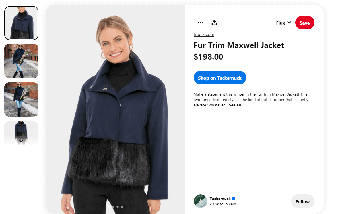
When you arrive on the PDP, you’re greeted by the same photo that originally caught your eye.
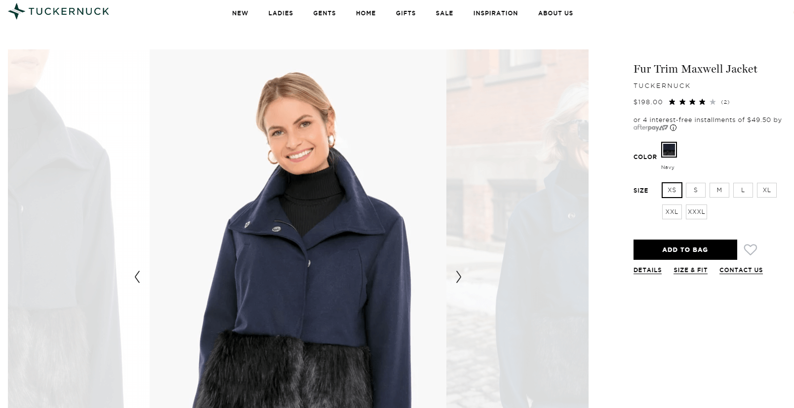
According to research from Pinterest, this is a pro move. Pins that go to landing pages with similar imagery have a 13% higher online sales lift.
As noted above, pins that link to product landing pages with the same or similar imagery are more likely to convert. And once the shopper is on the page and viewing the product that initially drew them in, they have the opportunity to recreate this exact look for themselves with a purchase or browse related items that may also interest them.
Encourage browsing by highlighting more than just related products
While a PDP should include information about the specific product being sold, invite shoppers to make discoveries by providing other items they may be interested in. The PDP could prompt users to “shop the look” and link to other items featured in the photo, or to view “more like this.”
Highlighting multiple products in lifestyle imagery invites shoppers to browse. You could even allow users to shop within the specific image that first grabbed their attention to create continuous browsing experiences from social to product pages. In the image below, a shopper can click on the “rowingblazers.com” link in the center of their social image and go right to the item.
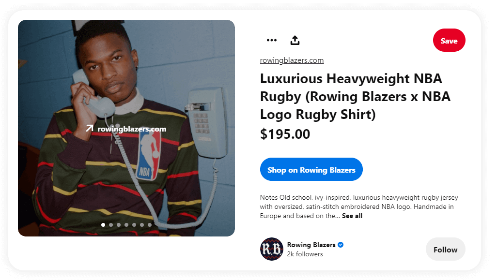
And a tool like Showroom shows the customer related products they may also be interested in, not just the products in the image. Showroom can easily be used in Instagram Story swipe-ups, paid ads, or linked to literally anywhere else a link can go, like emails and other webpages.
Personalize the experience
Brands can also encourage product discovery through page personalization by making product recommendations responsive to a visitor’s location and device type, as well as whether they’re a new or existing customer. A personalized shopping experience makes consumers 110% more likely to add more items to their cart and 40% more likely to spend more than originally planned.
Also consider deploying solutions that allow you to answer customer questions before they ask them. By leveraging data from past customers, you can create compelling and visually appealing pop-ups and page elements that answer questions about the product or service the shopper is looking at right now.
You’re even able to use these answers to point shoppers toward relevant or related products that they might otherwise have missed.
Engage customers from every possible angle
It’s imperative that your brand’s PDPs engage visitors during all aspects of the customer journey — whether they are just being introduced to the brand or are already close to making a purchase.
Redesigning your product landing pages to create a more consistent, engaging customer experience may seem daunting, but the time is well, well worth it.
Product detail pages have become a critical battleground for consumer attention and conversion. You need a 5-point audit for perfecting your product pages, covering key topics like organic search, social commerce, user-generated content, and insights. Find out what that means for you in our on-demand masterclass.


